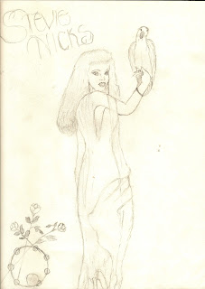
I am still "designing" in my head, but these are my preliminary ideas. My book is going to be about Stevie Nicks, an iconic singer/songwriter from my era. Her music, ideas and very presence were important to me and really are the musical backdrop of that period of my life. My first sketch is just fonts...which somehow I think will be very important to capturing her magical essence. I will likely use that font to print her name down the spine.( if anyone can suggest I site I can download a fancy, spidery font like that I'd love to hear!) I've then included a couple of pictures of her...but I'm not absolutely sure which ones will be on the finished product. The first picture of her holding the cockatoo(from an album cover) I will definitely use, and what I'd like to do is have the roses and tamborine at the bottom bleed around the spine to the back. The picture of her will be to the left of the front cover to allow that to bleed around, which will also give me the right side for a title and additional verbage. I have some ideas in mind for that. The second picture I may use on the back cover, or I may not. There are SO MANY great pictures of her on the internet that I will probably see how this "evolves" before I decide on which one. I also have this idea ( and its probably way too ambitious of me given my rudimentary Photoshop skills) of trying to do a black lacy type of boundary around the cover, or maybe even as a transparent layer. Again...we'll see how it evolves and what I can do. The background of the entire cover will be dark, probably with the fonts being white.
LOVE to hear any feedback on this...I'd really like to do a good job! Thanks...


No comments:
Post a Comment